Gallery / Personal journal
This page is a list that keeps track of the examples I have made. Some personal comments are also included.
Index
Exploring the basics of the package
Exploring basic statistical models
- KNN (and other) classification algorithms + p5.js
- Digit Recognition with GLM (with p5.js)
- Simple illustration of non-parametric estimation
Testing the power of the package
Examples created with specific goals in mind
Exploring the basics of the package
The first three apps were developed when I was exploring how JS works and how JS and R work together.
R-JS connection and a slider
This is the example that got this project started. The significant bit of this app is that it establishes a connection between R and JS. The slider is there to show it indeed works.
Slider with plotly.js
This follows from the previous example. Back then, I was experimenting how reactive the websocket approach can be. The motivation behind this is that a slider in shiny app does not react as I drag it; it reacts only when I release. In such a case, I am not able to see the “process” smoothly changing from one parameter to the other. To me, this is a major reason why I (and many other people) consider interactivity. This example was a success as it reacts as I drag the slider. It also gives me a rough idea how fast websocket can fire commands to R.
Exploring basic statistical models
After I got the basics right, I went straight to what I created this package for: understanding statistical models through interaction.
KNN (and other) classification algorithms + p5.js
This is inspired by Andrej Karpathy’s example. The first time I saw that, I was thinking “This is cool and it looks quite simple. Why don’t we (the statistics community) have more of this?”. After looking at the source code, I realise it’s JavaScript, and that’s when I decided I should learn some JS. (This app takes ~80 lines to complete in R using our package. Indeed simple app like this should not be that hard to code!)
After I created the app, it is easy to switch to different R classification algorithms (the JS part is the same of course!). I tried the usual logitic regression and Support Vector Machine (SVM) with radial kernel:
Logistic regression

There is nothing impressive there with the logistic regression. Standard linear classifier.
SVM with radial kernel
SVM with radial kernal caught my attention, as I failed to predict what the shape would look like when I added a new point (can you?). There was something unusual, but I do not know what exactly. I only realise what that is after trying out different examples and staring at a gif for a good 5 minutes. Indeed interaction is not about graphics but about processes – the ones that adopt interactivity and visual description (in contrast to static plot and verbal description) and the one that helps you discover and think.
Digit Recognition with GLM (with p5.js)
This is the example I used to teach my students GLM; the lesson was to formulate problems in statistical language. What’s interesting about this app is that you can try to fool the algorithm, or you can draw something other than digits and see what the algorithm thinks it is. The platform gives us a way to find the strength / expose the weakness of an algorithm. It turns out GLM relies heavily on edge cases while performing classification. More concretely, it doesn’t really look at the center part of the images, and it makes the decision based on mostly what pixels are activated near the edge. For example, if you activate some pixels at the three o’clock position, it will almost always classify it as a 4. We shall discuss this further in a different post. The point here is that interaction is a tool that can give you different (and often new) perspectives.
Simple illustration of non-parametric estimation

I made this after a friend said he didn’t understand my explanation: “Sample a point from the distribution, place a gaussian distribution there. Repeat this and sum up the distributions with reweighing would give a mixture that converges to the true density.”
Testing the power of the package
The following apps are created to experiment with the package further and explore its potential.
Stroke-based handwriting
This is motivated by this, but based on this. The goal is to find out what technique is needed to create interesting apps as seen in distill.pub and to learn from them.
Animated plots
Animatied plots are a common and convenient way to illustrate ideas. So I created these two apps.
Virtual Reality(VR)


Apparently there is an easy-to-use VR javascript library, A-frame, which can be ported to R easily using jsReact. To view the page using VR goggle, one simply needs to connect your phone to the same network then uses any browser to access the host computer ip:port address.
Spreadsheet
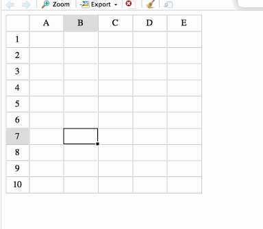
Spreadsheet is still the common way (for non-programmers) to do business analysis. It is no surprise there is a JS library for it already: jExcel. Porting this to R takes less than an hour (see ‘snippets’ folder on github). Further development can be made, e.g. add a button to save the csv to dataframe directly to R. Quite simple to do, but not useful to me. Someday maybe.
Examples created with specific goals in mind
Dimension reduction with tsne
This is an attempt to replicate this. Two goals. One is again to learn from the best data visualisation around, the other is to bring the interactive tsne to R. It seems useful to explore the tsne algorithm with different parameters and see the process of the estimation, but neither of them is offered by the R implementation at the moment.